| |
 he August 24, 2000 release of MEDLINEplus introduces a new design and modified organizational structure. These changes result from extensive usability testing and consumer feedback. Since MEDLINEplus' inception in October 1998, NLM has performed a range of usability testing on the site, including expert evaluation, informal user questioning and formal, videotaped observation of people using the site for the first time.
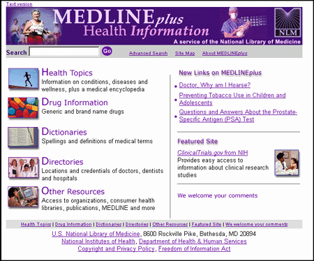
The new design (see Figure 1) retains many elements of the previous site, but now features four noticeable changes.
- A more attractive and compact home page
- Many users wanted to see more vivid pictures illustrating the kinds of information found on MEDLINEplus. MEDLINEplus developers added photographs to show the five major content areas (discussed below). These small photographs are optimized in order to make their file size as small as possible for quick page loading. "New Links on MEDLINEplus" are now located on the right side, along with a "Featured Site" that highlights NIH-related web sites.
- Five major "content" areas
- The following five groups along with their new pictures are found down the left side of the home page:
- Health Topics (including the medical encyclopedia)
- Drug Information
- Dictionaries
- Directories
- Other Resources (including organizations, consumer health libraries, publications, MEDLINE and more)
This new organizational structure results from consumer feedback and web log analysis. The majority of users search for health topics, drug information and dictionary assistance.
- A top navigation bar including a search box on every page
- Most web sites offer a search box on their pages and usability testing showed that consumers expect this feature, especially on the home page. Also, MEDLINEplus now offers site navigation on the top of every page, freeing up screen space on the left by eliminating the site navigation sidebar from many pages. Every page on MEDLINEplus, except for the home page, is now "liquid", meaning that the width of the top banner and body content will shrink or expand to any size browser window.
- Health topic pages that more prominently feature our selected links
- All the MEDLINEplus health topic pages now display the table of contents on the left side, grouped by four subcategories: NIH and clinical, organizations and tools (e.g., dictionaries, directories), population groups and other languages. The selected links start on the top, right side, so users no longer need to scroll down the page for the most useful information. The primary NIH institute, if one exists for the topic, is below the table of contents, followed by the preformulated MEDLINE searches and the related topics and categories.
No URLs have been changed as a result of the redesign, and the site will download faster than before. As always, NLM welcomes any comments and suggestions about MEDLINEplus. A link to "We welcome your comments" is at the bottom of every page.
By Jennifer Marill
Public Services Division

Marill, J. MEDLINEplus Site Redesigned. NLM Tech Bull. 2000 Jul-Aug;(315):e4.
| |


 he August 24, 2000 release of