A Brand New Look for PubMed Central
Like PubMed® and Bookshelf, PubMed Central® (PMC) has undergone a facelift or more accurately, an "interface"-lift, to not only enhance its overall look and feel but also provide users with easier access to PMC resources and information.
Specific improvements include:
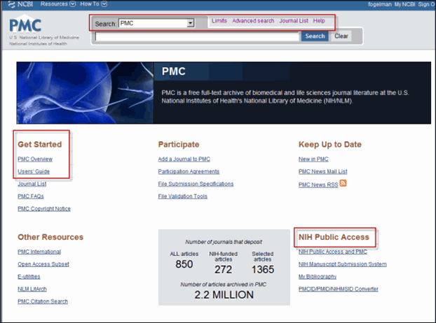
- A revamped homepage, which offers better navigation through the site as well as direct access to resources such as the Users' Guide and NIH Public Access information
- Redesigned Advanced Search and Limits pages
- An updated search results format
- Direct access to images in PMC articles
- A new organization and updated appearance for PMC's informational pages, including drop-down menus for navigation links
First Stop: Homepage
To take a tour through the "new" PMC, stop first at the homepage, which features a striking image of a neuron as well as a full menu of links to the resources and information that can be found on the site. You may want to start with "Get Started," conveniently located at the top left corner of the homepage (see Figure 1), and click on the Users' Guide, which links to the PubMed Central Help manual.
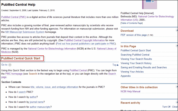
Once you are on the help page (see Figure 2), see the Quick Start menu for answers to any questions on PMC browsing and searching.
And Speaking of Searching….
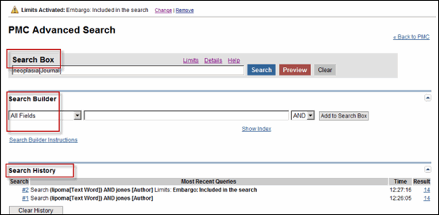
PMC Advanced Search (see Figure 3) has a new look, too. The format has been updated to conform with the Advanced Search pages for both PubMed and Bookshelf.
As before, you can enter topics or terms in the Search Box or continually refine your search through Search Builder, which offers a drop-down menu of fields such as text word, author, or journal. You can also continue to view your Search History at the bottom of the page.
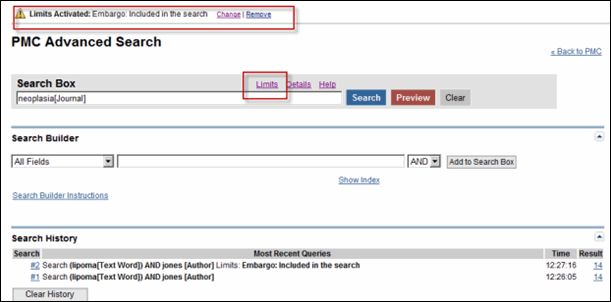
The Limits option on PMC Advanced Search also has a new location, along with links to Details and Help, at the top of the Search Box. As shown in Figure 4, Limits has been activated in order to include Embargoed Articles in the search result. Note that Change and Remove links have been added to allow for greater Limits usability.
Know Your Limits
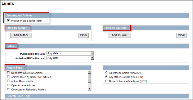
You can also get to Limits from the homepage or any of the search results pages. Once there (see Figure 5), note that the look of the page may be different but the previous options for narrowing your search - such as Embargoed Articles, Article Type, and Limit by Author - are still available.
Better Display for Search Results
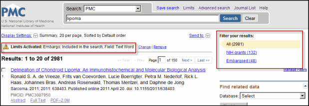
The PMC search results page also sports a redesigned format. As on PMC Advanced Search, there is a Limits Activated description and "warning" icon at the top of the summary results page, along with the Change and Remove options (see Figure 6). Additionally, Filter your results offers a summary view of the number of articles that correspond to each of the PMC search filters implemented on My NCBI.
Direct Access to Images
You can now find images in PMC articles through a simple PMC search. (Please note, however, that images will not appear for searches that use Limits or Advanced Search features.)
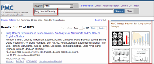
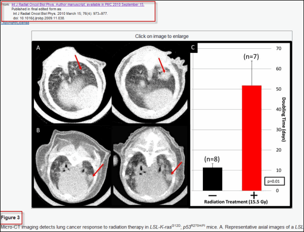
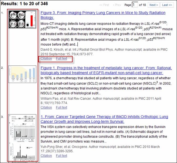
For example, as in Figure 7, once you enter a term, such as "lung cancer therapy" in the search box, PMC will automatically search all image captions in the archive and retrieve images related to this topic. Thumbnails for four or fewer of the most relevant images will appear on the top right-hand side of the summary results page.
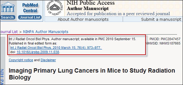
You can then mouse over a thumbnail to see the image pop up in a separate window, along with its caption and citation information. Or alternatively, click on the image thumbnail to open two windows - one from your current browser that shows the article in which the image appears (see Figure 8), and another to see the full view of the image (see Figure 9).
Click on See more, under the thumbnail display (see Figure 10), to get to a new search results page (see Figure 11) that lists all the matching images in PMC. You will see that the image thumbnails display next to their corresponding article citations, which also include links to both the full text PMC article page and the corresponding article citation in PubMed.
Organization and Navigation
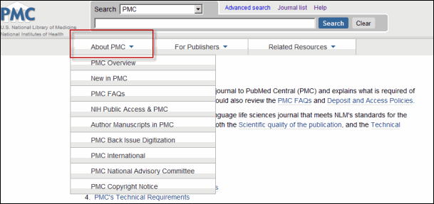
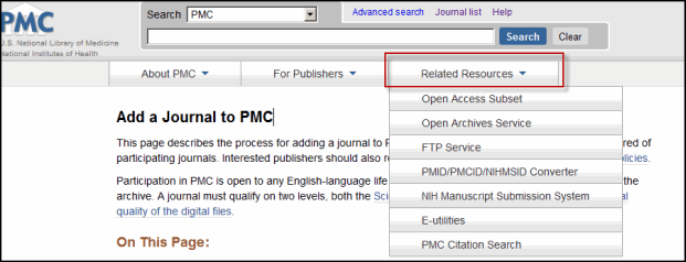
Finally, note the clean, updated look of the PMC informational pages, which have been organized into three main categories:
The navigation links, which were previously located on the sidebar, have been replaced by a drop-down menu for each category.
Further improvements to the PMC site are still to come. To be notified about these and other PMC developments, please subscribe to the PMC mailing list.
Fogelman M. A Brand New Look for PubMed Central. NLM Tech Bull. 2011 Jul-Aug;(381):e5.

