NLM® Releases New Design and Organization for its Main Web Site
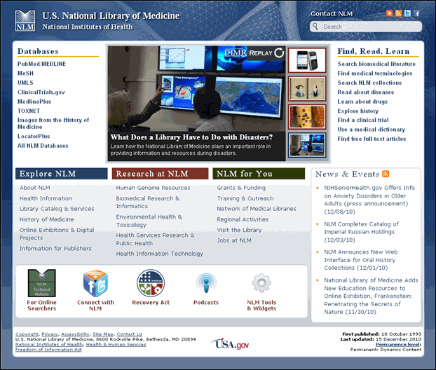
On January 11, 2011, the National Library of Medicine® (NLM) released a new design and organization for its main Web site. The NLM homepage (www.nlm.nih.gov) has an entirely new design, focused on users' top tasks (see Figure 1). We identified these top tasks with an analysis of Web page usage statistics, customer satisfaction survey data, search engine logs, and customer e-mails.
Major goals for this design were improved usability and a modernized appearance throughout the site. To accomplish this, we:
- placed more top task links right on the homepage, and also throughout the site by adding site-wide navigation in the header;
- added a "Share" feature so users can send content to friends, colleagues, or themselves via social bookmarking and networking;
- added links to interact with various NLM social media channels; and
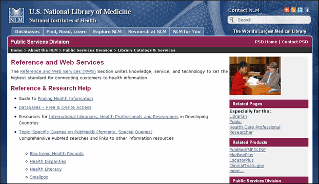
- updated headers and top navigation throughout (see Figure 2).
Additional highlights include:
- a rotating feature at the top of the homepage that highlights new resources, events, and content brought to you by NLM (see Figure 1);
- a "news & events" RSS feed (see Figure 1);
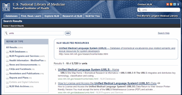
- improved site-wide searching featuring more refinement options (see Figure 3); and
- division branding integrated into the pages' headings and menus in addition to its previous place at the top of the page (see Figure 2).
NLM published its first Web site in October of 1993. It was one of the first U.S. federal Web sites. We released new looks for the site in 1996, 1999, and 2004. We encourage you to explore this most recent improvement and welcome your feedback via the Contact NLM link at the top of each page.
Heiland-Luedtke JR. NLM® Releases New Design and Organization for its Main Web Site. NLM® Tech Bull. 2011 Jan-Feb;(378):e2.


